Are you looking forward to impress your client with a design that can add a pinch of spice to the entire project? Well, how you want to design the page is completely your forte since you are the one who attends a client meet to discuss and get an idea of how your customer wants a website to be designed. So, no talk about that but you can refer to a tip or two to get an idea, if you want to try out a new design layout for the website. This article will therefore take you on a walk to talk about designing your website the unconventional way.
[m2leep]
What is the general layout of a typical web design?
For years, web designers have been following the typical website design principles, which follow the basic rectangular pattern that leads to upward-downward, left-right movement of the eyes. The key elements that made the layout of the home page were the header, the footer and the navigation bar. The top menu navigation bar was one of the common features on a web page design layout. While the header and the footer might remain the same, gone are the days when the traditional top navigation menu was considered the patent layout pattern. Web designers have now moved away from the mold by introducing intuitive navigation styles that make user interaction fun and engaging.
But it is not just about excitement and innovation. Check out these following advantages that make vertical navigation style a simpler and faster approach to a user experience.
Advantages of Using The Vertical Menu Bar
- Easy Navigation On A Single Page Layout
A vertical menu bar brings an easy navigation flow thoroughout a single page layout, without having to wait for the next page to come that can turn out to be annoying. The vertical menu bar layout can be implemented in a responsive web design for better navigation for any screen size.
- Keeping It Short and Simple
When using a vertical navigation menu, you need to tailor it with information that is short. Small basic links are said to perform better compared to texts that are lengthy and descriptive. This helps to keep the attention of the visitors engaged instead of making them lose focus from the main CTA objective.
A vertical navigation menu bar opens with the same width and height no matter from where you access it. It is therefore ideal for usage on a Responsive design layout and therefore is fit for any screen size.
Web design has evolved from what it was before. When using a vertical navigation bar, one needs to ensure that the general layout is kept simple and compact for better user experience. Here are some best examples you can refer to when using the vertical search navigation menu on your web page.
7 Websites that exemplify the use of Vertical Navigation Menus
1- Single Page Navigation
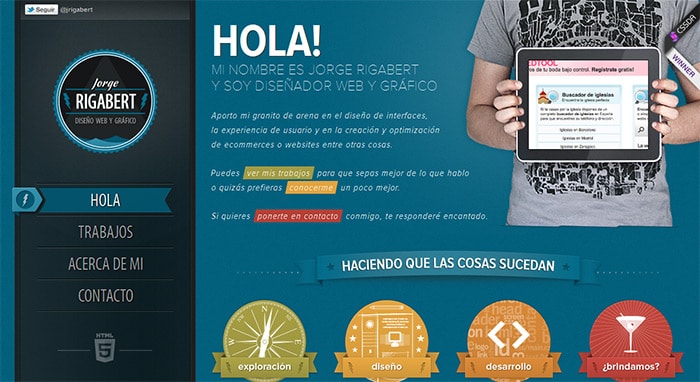
Single page web page design is fun and fast, compared to the traditional website pages. A vertical navigation bar helps one to maintain a smooth interface, while at the same time ensuring faster access to information. Jorge Rigabert’s website portfolio http://www.jorgerigabert.com/ shows how the navigation bar can link to each content section when clicked directly on each button. Notice how the website uses different color schemes for each content section, which corresponds with the navigation button colors. When one clicks on the navigation buttons, they not only change their colors accordingly, but also scroll along with the web page.
2 – Multi Page Navigation
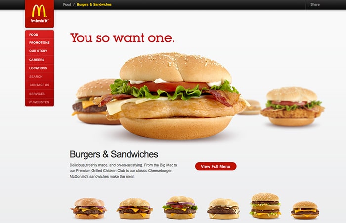
Not every website can maintain a single page layout to support their storehouse of information. In this case a single page layout might look clumsy. However, there are alternative ways to use the vertical navigation menu. Websites like Mcdonalds have tried to maintain a color scheme that matches the company logo. When you hover over each link, a bubble box appears with options that provide further links to different pages of the website. This is called the multi page navigation. According to an observation pointed out by the Nielson Norman Group http://www.nngroup.com/articles/horizontal-attention-leans-left/, when visiting a website our attention tends to flow from left to right. You can place the vertical navigation menu anywhere you like but it would help to keep a visitor’s attention constant if you can place it on the left side of the website design.
3 – The Three Lined Drawer Navigation
Sometimes a website design is so great that inserting any additional element in the layout may tend to spoil the entire look. It can even distract the visitor’s attention, thus proving to be a hindrance when your design was supposed to create a mesmerizing effect on the audience’s mind. Such distractions could be caused by a navigation menu. What you can do instead, is make use of the three lined menu navicon. One can access the navigation menu only when one wants to, by simply clicking on the navicon. This helps to keep away any kind of visual distraction that usually happens with a drop down navigation menu.
Keeping It Short And Simple is the mantra for any web page design, especially if you want to adopt the vertical web page navigation menu for your site. There is no other perfect example for this than the design layout of Kickpoint http://kickpoint.ca/

4 – The Compact Navigation
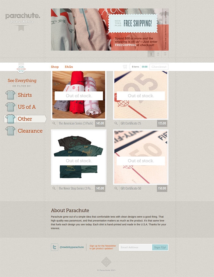
Parachute http://www.madebyparachute.com/products is one website that shows the importance of using minimum elements when designing a website with vertical navigation menu. The site has a fixed navigation bar that includes a maximum of four to five links, which are accompanied by small icons. This makes the website design simplistic enough that helps to keep up a constant attention on the products, instead of leading to unnecessary diversions.
The above mentioned examples are some of the trends that many websites are following nowadays. However, if you are searching for something that you have never seen before, then here are three design trends that you might be interested to look into. They can put your client in awe!
5 – The Vertical Cum Horizontal Navigation
The vertical cum horizontal navigation layout brings an interesting user experience to play, since users can easily swipe between the different contents like one would on a parallax web design. The beauty of using this type of design on one’s layout is that, they not only bring a web design to life with creative ideas that are in motion when one starts scrolling further; but provide a smooth interface irrespective of the internet connection speed or the type of device you use. The vertical cum horizontal navigation scroll allows one to smoothly surf across the entire website. French illustrator, graphic and website designer, Pauline Osmot sets an effective example of how to use the navigation menu for horizontal and vertical motion that you might want to check out. http://www.paulineosmont.com/

6- The Zero Vertical Scroll Navigation
A vertical navigation menu can be used in a number of ways and the zero vertical scroll is one rare but brilliant example. That means your navigation menu remains fixed when you scroll through your website. This keeps the content intact only within the screen area that is visible from your device screen. This is different from the other navigation styles, since generally the menu bar is shown to accompany you as you scroll down the web page. In case of the zero vertical scroll navigation, the menu bar stays fixed in its place, while your content accompanies you depending on where you click. Mammoth is one such website that uses the zero vertical scroll navigation style http://mammothmedia.tv/ .

7 – Vertical Scroll Parallax Navigation
This is an interesting technique, where as you scroll through the website the background images transform to create a 3D illusion. Implementing this technique in your design can give an overall dynamic effect to your website by creating an animation effect that makes your site more engaging. Bake Agency’s website uses the vertical scroll parallax navigation in a unique and creative way http://www.bakeagency.it/#/

Vertical scroll navigation is now the new trend and many website designers have found a new way to make sites more fun and interesting for visitors. A visitor needs to be constantly kept engaged when he/she enters a web page. If you are one of those interesting souls who likes to take a work over to the edge, then vertical scroll navigation is the next thing you should try out for your web design.